Introduction to Clipping Using clip-path in CSS
clip-path is a very interesting property that allows to clip the visible portion of SVG elements, images or any HTML element really.
At this time, clip-path still needs to be prefixed with -webkit- for it to work in Safari.
Defining Basic Shapes With clip-path
clip-path makes it easy to clip-out basic shapes using either of the polygon, ellipse, circle or inset keywords, which are part of the CSS exclusion module.
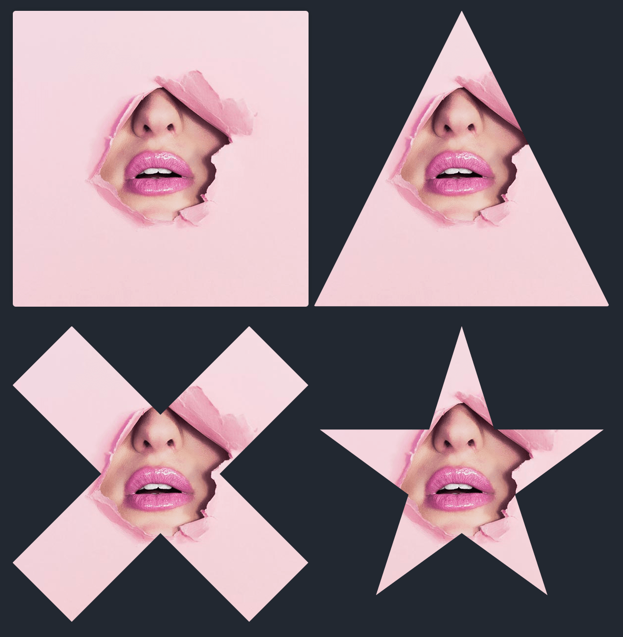
Polygon
Polygon is the most flexible of all the available shapes because it allows you to specify any amount of points, a little bit like an SVG path. The provided points are pairs of X and Y coordinates that can be of any unit (eg: pixel or percent-based). Because it’s the most flexible, it’s also the most complex and you’ll probably want to use a tool to define your points.
Let’s illustrate with an example. First you’ll see our starting image, then our image with a clip-path applied to get a triangle shape, followed by a more complex X-shape, and then finally a star shape:
/* Triangle */
.polygon1 {
  -webkit-clip-path: polygon(50% 0%, 0% 100%, 100% 100%);
  clip-path: polygon(50% 0%, 0% 100%, 100% 100%);
}
/* X */
.polygon2 {
  -webkit-clip-path: polygon(20% 0%, 0% 20%, 30% 50%, 0% 80%, 20% 100%, 50% 70%, 80% 100%, 100% 80%, 70% 50%, 100% 20%, 80% 0%, 50% 30%);
  clip-path: polygon(20% 0%, 0% 20%, 30% 50%, 0% 80%, 20% 100%, 50% 70%, 80% 100%, 100% 80%, 70% 50%, 100% 20%, 80% 0%, 50% 30%);
}
/* Star */
.polygon3 {
  -webkit-clip-path: polygon(50% 0%, 61% 35%, 98% 35%, 68% 57%, 79% 91%, 50% 70%, 21% 91%, 32% 57%, 2% 35%, 39% 35%);
  clip-path: polygon(50% 0%, 61% 35%, 98% 35%, 68% 57%, 79% 91%, 50% 70%, 21% 91%, 32% 57%, 2% 35%, 39% 35%);
}
Circle
Circles are defined with this syntax: circle(radius at posX posY). The position is optional and will default to 50% 50%. Here are two examples to illustrate:
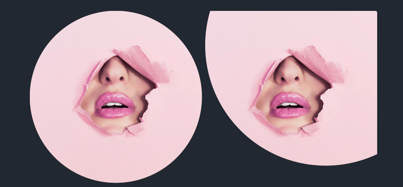
.circle {
  -webkit-clip-path: circle(50%);
  clip-path: circle(50%);
}
.circle2 {
  -webkit-clip-path: circle(70% at 70% 20%);
  clip-path: circle(70% at 70% 20%);
}
Ellipse
Ellipses are defined using this syntax: ellipse(radiusX radiusY at posX posY). Once again, the position is optional and will default to 50% 50%. Here are two examples:
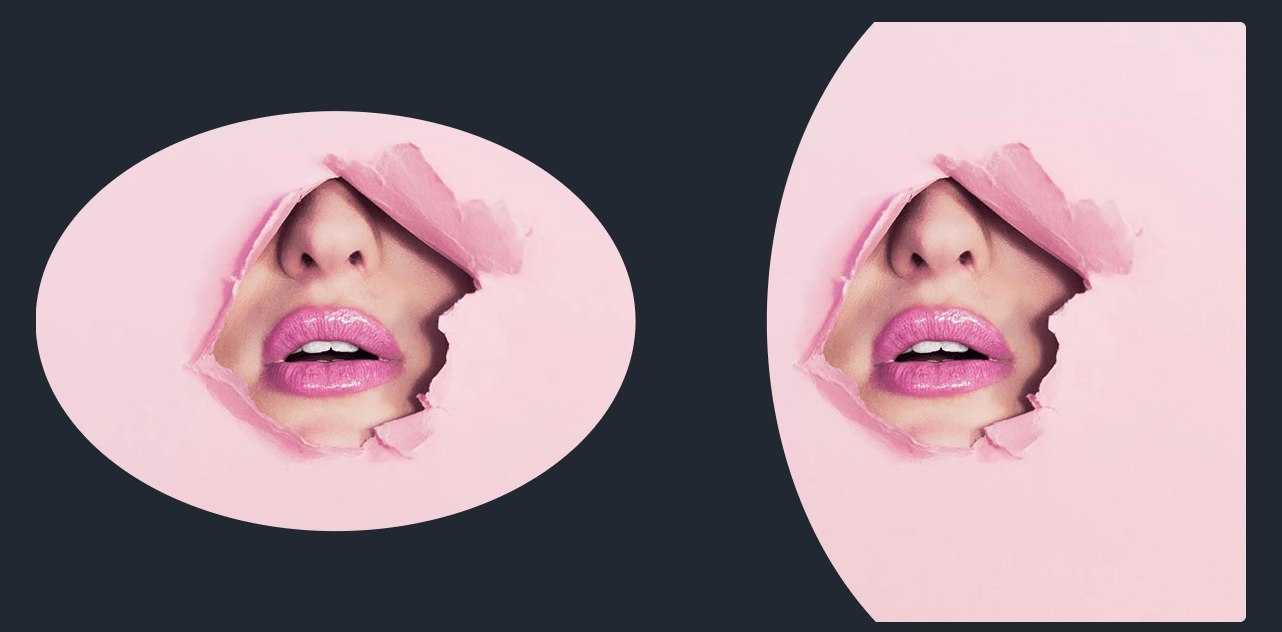
.ellipse {
  -webkit-clip-path: ellipse(50% 35%);
  clip-path: ellipse(50% 35%);
}
.ellipse2 {
  -webkit-clip-path: ellipse(50% 65% at 70% 50%);
  clip-path: ellipse(50% 65% at 70% 50%);
}
Inset
With inset you can define an inner rectangle and everything outside will be cut-out. This makes it easy to effectively crop an image or an element directly in the browser. You can also make the rectangle rounded with the round keyword and a border radius value:
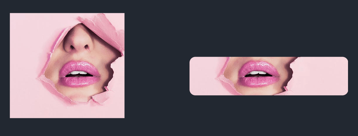
.inset {
  -webkit-clip-path: inset(20% 25% 20% 10%);
  clip-path: inset(20% 25% 20% 10%);
}
.inset2 {
  -webkit-clip-path: inset(45% 0% 33% 10% round 10px);
  clip-path: inset(45% 0% 33% 10% round 10px);
}
Animations and Transitions
Animations and transitions can also be applied with clip-path to create interesting effects. Just make sure that all the steps in your animation contains the same amount of points. Let’s demonstrate with an example:
Here’s the CSS rules used to create this animation:
img.animate {
  animation: magic 4s infinite;
}

@keyframes magic {
  0% {
    -webkit-clip-path: polygon(0 0, 100% 0, 100% 100%, 0% 100%);
    clip-path: polygon(0 0, 100% 0, 100% 100%, 0% 100%);
  }
  20% {
    -webkit-clip-path: polygon(28% 0, 73% 0, 100% 100%, 0% 100%);
    clip-path: polygon(28% 0, 73% 0, 100% 100%, 0% 100%);
  }
  40% {
    -webkit-clip-path: polygon(0 0, 100% 72%, 100% 100%, 0 35%);
    clip-path: polygon(0 0, 100% 72%, 100% 100%, 0 35%);
  }
  60% {
    -webkit-clip-path: polygon(50% 0, 50% 0, 100% 100%, 0% 100%);
    clip-path: polygon(50% 0, 50% 0, 100% 100%, 0% 100%);
  }
  80% {
    -webkit-clip-path: polygon(0 70%, 100% 0, 100% 32%, 0 100%);
    clip-path: polygon(0 70%, 100% 0, 100% 32%, 0 100%);
  }
  100% {
    -webkit-clip-path: polygon(0 0, 100% 0, 100% 100%, 0% 100%);
    clip-path: polygon(0 0, 100% 0, 100% 100%, 0% 100%);
  }
}
Oh, and in case you’re interested in the little script to make the start/stop button work. It’s as simple as adding or removing the animate class on our image:
let toAnimate = document.querySelector('.trigger');
let button = document.querySelector('.trigger-btn');

button.addEventListener('click', function() {
  if (toAnimate.classList.contains('animate')) {
    toAnimate.classList.remove('animate');
    this.innerText = 'Start';
  } else {
    toAnimate.classList.add('animate');
    this.innerText = 'Stop';
  }
});
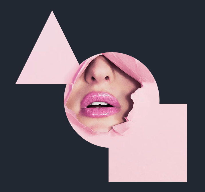
Custom SVG Shapes
You can also define any arbitrary SVG shape to act as the clip-path value. You’ll obviously want to start in a tool like Sketch to create your shape and then copy the SVG markup into a text editor. In your SVG markup, simply wrap your shape in a clipPath element and wrap the clipPath in a defs block.
Something like this for example:
<svg width="0" height="0">
  <defs>
    <clipPath id="my-shape">
      <path d="M89.6342913,129 C86.6318679,137.611315 85,146.865086 85,156.5 C85,200.767808 119.448105,236.989829 163,239.821749 L163,300 L300,300 L300,163 L251.750745,163 C251.915896,160.855015 252,158.687329 252,156.5 C252,110.384223 214.615777,73 168.5,73 C146.712501,73 126.873981,81.3445721 112.006052,95.0121046 L64.5,0 L0,129 L89.6342881,129 Z">
      </path>
    </clipPath>
  </defs>
</svg>
And now you can apply the defined shape as the clip-path value using the url keyword and the id of the SVG shape:
.svg-shape {
  -webkit-clip-path: url(#my-shape);
  clip-path: url(#my-shape);
}


 на 100 слоях")


