Create Staggering Animations in React
In this article, we’ll create a really compelling animation effect using basic React modules. You’ll be surprised how easy this is!
You might know how to create simple animations in React, but how are staggered animations like this achieved?
It’s actually pretty easy with React and CSS! Follow along in this article as we build this animation effect.
The Basic Animation
If you haven’t setup an animation before with React, let’s do that right now. There are many approaches but a tried-and-true approach is to use CSS Transitions and styled-components. Don’t worry too much about the tech we’re using, the ideas you learn here can translate to another CSS-in-JS library, or with React Hooks!
The first thing is to output the list of fruits (I’ll abridge any CSS that’s not particularly interesting for our exercise):
import React, { Component } from 'react';
import "styled-components/macro";

const fruits = [
  'Apple',
  'Banana',
  'Cherry',
  'Grape',
  'Kiwi',
  'Lemon',
  'Pear',
  'Pineapple',
];

class Item extends Component {
  render() {
    return (
      <div>
        {this.props.name}
      </div>
    );
  }
};

class App extends Component {
  render() {
    return (
      <div css={`
        width: 300px; // "styled-components/macro" enables raw CSS!
      `}>

        // output the fruits!
        {fruits.map((fruit) => {
          return (
            <Item name={fruit}/>
          )
        })}

      </div>
    );
  }
};
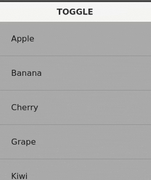
You should have something like this now:
Doesn’t really do anything so let’s add the button to toggle the animation. We’ll also need to introduce some React state into the App component:
class Item extends Component {
  render() {
    return (
      <div
        css={`
          transform: ${this.props.isVisible
            ? 'translateX(0%)'
            : 'translateX(100%)'};
          transition: transform 0.5s ease-in-out;
        `}
      >
        {this.props.name}
      </div>
    )
  }
};

class App extends Component {
  state = {
    isVisible: true
  }
  render() {
    return (
      <div css={`
        width: 300px;
      `}>

        <button onClick={() => this.setState({isVisible: !this.state.isVisible})}>
          TOGGLE
        </button>

        {fruits.map((fruit) => {
          return (
            <Item
              isVisible={this.state.isVisible}
              name={fruit}
            />
          )
        })}

      </div>
    );
  }
}
Now when you click the button, you’ll see an animation! If you’ve already learned something about animating in React, pat yourself on the back! This is a huge milestone 😁
We’re almost there! Let’s add the secret sauce to achieve that staggering effect.
Staggering the Animation
In order to stagger the animation, the key ingredient is a lesser-known part of CSS Transition: the transition-delay property!
What we want to achieve is to create more delay for an <Item> if it comes later in the list. To accomplish this, we pass the index of the <Item> and multiply with our “stagger” time (which we’ll define as 100ms).
This is the resulting transition-delay that each <Item> will get:
const fruits = [
  'Apple',      //   0ms = 100ms * 0
  'Banana',     // 100ms = 100ms * 1
  'Cherry',     // 200ms = 100ms * 2
  'Grape',      // 300ms = 100ms * 3
  'Kiwi',       // 400ms = 100ms * 4
  'Lemon',      // 500ms = 100ms * 5
  'Pear',       // 600ms = 100ms * 6
  'Pineapple',  // 700ms = 100ms * 7
];
Here’s the final code snippet. The interesting part is where we calculate transition-delay!
import React, { Component } from 'react';
import "styled-components/macro";

const fruits = [
  'Apple',
  'Banana',
  'Cherry',
  'Grape',
  'Kiwi',
  'Lemon',
  'Pear',
  'Pineapple',
];
const stagger = 100;

class Item extends Component {
  render() {
    return (
      <div
        css={`
          transform: ${this.props.isVisible
            ? 'translateX(0%)'
            : 'translateX(100%)'};
          transition-duration: 0.5s;
          transition-timing-function: ease-in-out;
          transition-property: transform;
          transition-delay: ${stagger * this.props.index}ms;  // secret sauce!

        `}
      >
        {this.props.name}
      </div>
    )
  }
};

class App extends Component {
  state = {
    isVisible: true
  }
  render() {
    return (
      <div css={`
        width: 300px;
      `}>

        <button onClick={() => this.setState({isVisible: !this.state.isVisible})}>
          TOGGLE
        </button>

        {fruits.map((fruit, index) => {
          return (
            <Item
              isVisible={this.state.isVisible}
              index={index}
              name={fruit}
            />
          )
        })}

      </div>
    );
  }
}
You can still use the shorthand CSS transition property, but it’s written in the long-form so you can see the transition-delay property clearly.
Wrapping Up
It’s as simple as that! It’s a really cool effect for introducing any list/series of items in a dramatic fashion. It doesn’t have to be a simple translateX() animation either. You could:
- Animate GoogleMaterial Cards instead of a vertical column of items
- Stagger the animation for both
opacityandtransformsimultaneously (slightly adjusted our demo) - Use Fibbonacci sequences instead of a flat stagger time to exhibit more life-like animations


 и Thread.yield()?")


 на 100 слоях")


