Better Modals in React
Learn about how we can build fully customized, accessible, and better modals in React using a React API called Portals.
Since the beginning of the web, creating modals or other types of floating elements — like a floating menu — has never been an easy task at all. We didn’t and still don’t have a nice and absolutely standard way to create that type of element. In React, we used to create modals or any kind of floating element using a lot of approaches: creating a simple component and rendering it above everything — poorly, but it worked — and customizing it the way you want it.
Now, we have Portals in React, and we’re able to render elements outside its parent component. That means that creating elements like modals has never been easier! So, let’s dive in and learn more about Portals and how we can use them.
Modals
Inside every application nowadays, we can have a lot of modals. We’re using them everywhere because they are so practical to build and can improve a lot in our UI/UX. The benefits of using modals in our applications can be:
- They allow us to get the user’s attention to a specific point, by just showing one element and improving our feedback depending on what we want.
- We can use them in a lot of situations that require more attention from the user, such as sign in / sign up forms, alert messages, quick actions — like an e-commerce cart — and some pop-up messages.
The problem with modals in React was: how we can build them the right way? In React, until Version 16, we didn’t have any API or a better, standard way to build and create accessible modals. So a lot of developers invented a bunch of different methods trying to achieve the same thing: an accessible and easy-to-build modal. Developers either tried their own way to create them or started to use a UI library that had prebuilt options.
Since the release of Version 16 of React, we have Portals. But what are they exactly?
How Portals Work
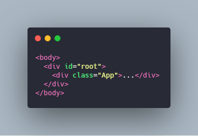
In React, we work with components all the time, and our main component most of the time is called <App />. When our application is rendered, in the DOM, the parent component is called root, and it’s rendered as a div so all the child components are rendered inside of this element.

So now, let’s imagine that we want to render an element outside the parent element — in our case, it’s the root div. Well, we can’t, and this is exactly the problem that Portals came to solve in React.
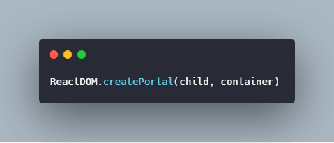
We can create a Portal by simply importing react-dom. Then the first argument of the createPortal function will be any valid React child element, and the second argument will be a DOM element.
But, to explore how it really works, let’s create a mini-project and create a modal using Portals to see how it works under the hood.
Implementing Portals
To start working with Portals, let’s use react-dom to create a new React app. In your terminal, run the following command:
We won’t need any dependency to work with it; we just need the newest version of React itself. Although Portals was introduced in the 16th version, we’re going to use React Hooks also; so we need Version 16.8.
To get started, we’re going to create a custom hook called useModal. So, create a file called useModal.js, and inside of it, put the following code:
import { useState } from "react";

  const useModal = () => {
      const [open, onOpenModal] = useState(false);
      const [close, onCloseModal] = useState(false);

      const openModal = () => {
          onOpenModal(true);
      };

      const closeModal = () => {
          onCloseModal(true);
          onOpenModal(false);
      };

      return { open, close, openModal, closeModal };
  };

  export default useModal;
Now, let’s create a component called App.js, which is going to be our main component, where we’re going to handle our modal state. Inside our App.js, put the following code:
import React from "react";

   const App = () => {
       const { open, openModal, closeModal } = useModal();

       return (
         <div className="App">
           <h1>Modals in React!</h1>
           <button onClick={openModal}>Open</button>
         </div>
       );
   };

   export default App;
It’s a simple component that has a button. We’re also destructuring our custom hook inside our component, but we don’t yet have any action. Now, let’s have fun and start to create our Portal.
Create a file called Portal.js, and inside that file, let’s import two things:
import { useEffect } from "react";
   import { createPortal } from "react-dom";
First, we’re importing the useEffect hook, to perform some side-effect in our function, and then the createPortal to render our element outside the DOM parent.
Now, let’s create an arrow function called Portal, and pass an argument called children to it — which is going to be a valid React element — and then put the following code inside it:
const Portal = ({ children }) => {
       let modalRoot = document.getElementById("modal");

     ...
   };
Here we’re getting an element from our DOM tree called modal. But we don’t have an element called modal there, yet. So, now, let’s create a conditional statement, which is going to be like this:
if (!modalRoot) {
       modalRoot = document.createElement("div");
       modalRoot.setAttribute("id", "modal");
       document.body.appendChild(modalRoot);
   }
Very easy, it’s a conditional to test if we have an element called modal; if it’s false, we’re going to create a new element, a div, and we’ll set a “modal” id to it and append it to our body.
Next, we’re going to create an element called modalElement, and inside our useEffect hook, we’re going to append it to our modalRoot div. So the rest of our function is going to be like this:
const modalElement = document.createElement("div");

   useEffect(() => {
       modalRoot.appendChild(modalElement);
       return () => modalRoot.removeChild(modalElement);
   });

   return createPortal(children, modalElement);
Now, our Portal function should look like this:
const Portal = ({ children }) => {
        let modalRoot = document.getElementById("modal");

        if (!modalRoot) {
            modalRoot = document.createElement("div");
            modalRoot.setAttribute("id", "modal");
            document.body.appendChild(modalRoot);
        }

        const modalElement = document.createElement("div");

        useEffect(() => {
            modalRoot.appendChild(modalElement);
            return () => modalRoot.removeChild(modalElement);
        });

        return createPortal(children, modalElement);
    };
Creating our Styled Modal
After we’ve created our Portal, we should create our styled modal, and use the Portal function that we created to render our elements. So, create a file called Modal.js, and inside of this file, import the Portal that we created above and add the following code:
import React from "react";

    import Portal from "./Portal";

    const Remodal = ({ children, close, render }) => {
        return (
        <Portal>
            <div>
            <div
            style={{
            display: "flex",
            justifyContent: "center",
            alignItems: "center",
            position: "absolute",
            top: 0,
            left: 0,
            width: "100%",
            height: "100%"
            }}
            >

            <div
            style={{
            position: "relative",
            background: "white",
            borderRadius: "2px",
            padding: "15px",
            minWidth: "320px",
            maxWidth: "600px",
            maxHeight: "600px",
            zIndex: 10,
            boxShadow: "2px 2px 10px rgba(0, 0, 0, 0.3)",
            marginBottom: "100px"
            }}
            >
            {render(children) || children}
            <hr />
            <button onClick={close}>Close</button>
            </div>

            </div>
            <div
            style={{
            position: "absolute",
            width: "100%",
            height: "100%",
            top: 0,
            left: 0,
            background: "black",
            opacity: 0.5
            }}
            />
            </div>
        </Portal>
        );
    };

    export default Remodal;
We’re importing our Portal, and inside of it, we’re using some divs and styling it with some inline CSS, so we can see our results very clearly.
To finish our modal and see it working, let’s go to our App.js component, and import our modal component. We’re going to use another conditional statement here, so that when we click the button we’re going to change our open state to true and it’s going to open the modal. When we click the close button, we’re going to close the modal. Our App.js component will look like this:
import React from "react";

   import Modal from "./Modal";
   import useModal from "./useModal";

   const App = () => {
     const { open, openModal, closeModal } = useModal();

     return (
      <div className="App">
        <h1>Modals in React!</h1>
        <button onClick={openModal}>Open</button>
         {open ? (
          <Modal
           close={closeModal}
           render={() => <h1>This is a Modal using Portals!</h1>}
           />
          ) : null}
       </div>
       );
   };

   export default App;
Now, we have a modal working fine using the Portal API, and we just created three files! You can create better and more accessible modals, and also style them the way you want — all you need is your imagination.
Building Rich Apps with KendoReact
If you don’t want to create modals from scratch, you can use a UI library, and I highly recommend you try out KendoReact. It’s a complete UI component library for React, built with high-quality and responsive components.
It includes all the components that you need, from a basic app through a complex app, so with KendoReact you can focus on what matters in your app and stop trying to build complex UI components.
Conclusion
In this article, we’ve learned about modals, and how we can build them easily in React using Portals. With Portals, we can render elements outside the parent element pretty easily, rendering it above everything. If you want to learn more about Portals, I highly recommend you create a lot of personalized modals and floating menus to learn how you can benefit from this API and build amazing applications using it.


