
Фигуры на чистом CSS
На CSS можно создавать всевозможные формы. Квадраты и прямоугольники просты, поскольку они являются естественными формами в Интернете. Добавьте ширину и высоту, и вы получите прямоугольник нужного вам размера. Добавьте border-radius и вы сможете скруглить эту форму, а достаточное его количество позволит превратить прямоугольники в круги и овалы.
В CSS также есть псевдоэлементы ::before и ::after, которые дают нам возможность добавить еще две фигуры к исходному элементу. Умно используя позиционирование, преобразование и многие другие приемы, мы можем создавать множество форм в CSS с помощью всего одного элемента HTML.
Квадратная форма Square Shape
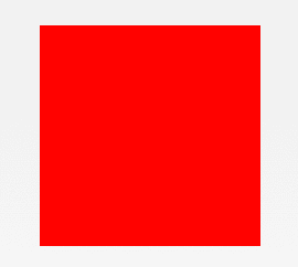
#square {
  width: 100px;
  height: 100px;
  background: red;
}
Прямоугольная форма Rectangle Shape
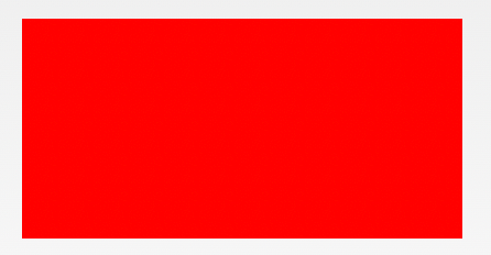
#rectangle {
  width: 200px;
  height: 100px;
  background: red;
}
Форма круга Circle Shape
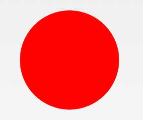
#circle {
  width: 100px;
  height: 100px;
  background: red;
  border-radius: 50%
}
Овальная форма Oval Shape
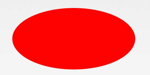
#oval {
  width: 200px;
  height: 100px;
  background: red;
  border-radius: 100px / 50px;
}
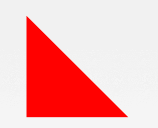
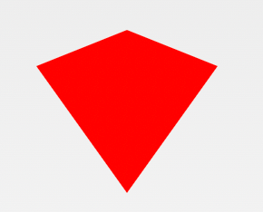
Форма треугольника вверх Triangle Up Shape
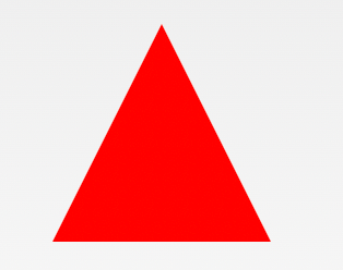
#triangle-up {
  width: 0;
  height: 0;
  border-left: 50px solid transparent;
  border-right: 50px solid transparent;
  border-bottom: 100px solid red;
}
Форма треугольника вниз Triangle Down Shape
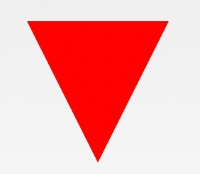
#triangle-down {
  width: 0;
  height: 0;
  border-left: 50px solid transparent;
  border-right: 50px solid transparent;
  border-top: 100px solid red;
}
Левая форма треугольника Triangle Left Shape
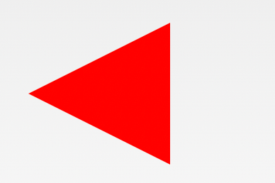
#triangle-left {
  width: 0;
  height: 0;
  border-top: 50px solid transparent;
  border-right: 100px solid red;
  border-bottom: 50px solid transparent;
}
Правая форма треугольника Triangle Right Shape
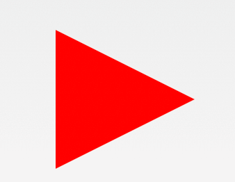
#triangle-right {
  width: 0;
  height: 0;
  border-top: 50px solid transparent;
  border-left: 100px solid red;
  border-bottom: 50px solid transparent;
}
Форма треугольника сверху слева Triangle Top Left Shape
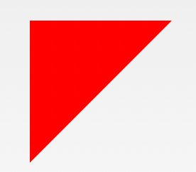
#triangle-topleft {
  width: 0;
  height: 0;
  border-top: 100px solid red;
  border-right: 100px solid transparent;
}
Форма треугольника сверху справа Triangle Top Right Shape
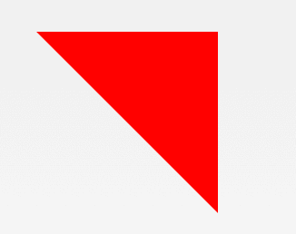
#triangle-topright {
  width: 0;
  height: 0;
  border-top: 100px solid red;
  border-left: 100px solid transparent;
}
Форма треугольника снизу слева Triangle Bottom Left Shape
#triangle-bottomleft {
  width: 0;
  height: 0;
  border-bottom: 100px solid red;
  border-right: 100px solid transparent;
}
Форма треугольника снизу справа Triangle Bottom Right Shape

#triangle-bottomright {
  width: 0;
  height: 0;
  border-bottom: 100px solid red;
  border-left: 100px solid transparent;
}
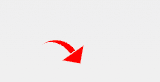
Форма стрелы с изогнутым хвостом Curved Tail Arrow Shape
#curvedarrow {
  position: relative;
  width: 0;
  height: 0;
  border-top: 9px solid transparent;
  border-right: 9px solid red;
  transform: rotate(10deg);
}
#curvedarrow:after {
  content: "";
  position: absolute;
  border: 0 solid transparent;
  border-top: 3px solid red;
  border-radius: 20px 0 0 0;
  top: -12px;
  left: -9px;
  width: 12px;
  height: 12px;
  transform: rotate(45deg);
}
Трапециевидная форма Trapezoid Shape
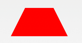
#trapezoid {<br />
  border-bottom: 100px solid red;<br />
  border-left: 25px solid transparent;<br />
  border-right: 25px solid transparent;<br />
  height: 0;<br />
  width: 100px;<br />
}<br />
Форма параллелограмма Parallelogram Shape

#parallelogram {
  width: 150px;
  height: 100px;
  transform: skew(20deg);
  background: red;
}
Звезда (6 точек) Форма Star (6-points) Shape
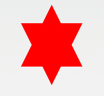
#star-six {
  width: 0;
  height: 0;
  border-left: 50px solid transparent;
  border-right: 50px solid transparent;
  border-bottom: 100px solid red;
  position: relative;
}
#star-six:after {
  width: 0;
  height: 0;
  border-left: 50px solid transparent;
  border-right: 50px solid transparent;
  border-top: 100px solid red;
  position: absolute;
  content: "";
  top: 30px;
  left: -50px;
}
Форма звезды (5 точек) Star (5-points) Shape
#star-five {
  margin: 50px 0;
  position: relative;
  display: block;
  color: red;
  width: 0px;
  height: 0px;
  border-right: 100px solid transparent;
  border-bottom: 70px solid red;
  border-left: 100px solid transparent;
  transform: rotate(35deg);
}
#star-five:before {
  border-bottom: 80px solid red;
  border-left: 30px solid transparent;
  border-right: 30px solid transparent;
  position: absolute;
  height: 0;
  width: 0;
  top: -45px;
  left: -65px;
  display: block;
  content: '';
  transform: rotate(-35deg);
}
#star-five:after {
  position: absolute;
  display: block;
  color: red;
  top: 3px;
  left: -105px;
  width: 0px;
  height: 0px;
  border-right: 100px solid transparent;
  border-bottom: 70px solid red;
  border-left: 100px solid transparent;
  transform: rotate(-70deg);
  content: '';
}
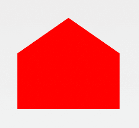
Форма пентагона Pentagon Shape
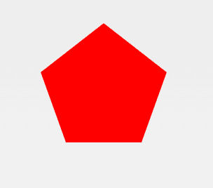
#pentagon {
  position: relative;
  width: 54px;
  box-sizing: content-box;
  border-width: 50px 18px 0;
  border-style: solid;
  border-color: red transparent;
}
#pentagon:before {
  content: "";
  position: absolute;
  height: 0;
  width: 0;
  top: -85px;
  left: -18px;
  border-width: 0 45px 35px;
  border-style: solid;
  border-color: transparent transparent red;
}
Форма шестиугольника Hexagon Shape
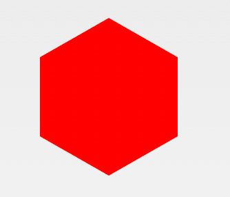
#hexagon {
  width: 100px;
  height: 57.735px;
  background: red;
  position: relative;
}
#hexagon::before {
  content: "";
  position: absolute;
  top: -28.8675px;
  left: 0;
  width: 0;
  height: 0;
  border-left: 50px solid transparent;
  border-right: 50px solid transparent;
  border-bottom: 28.8675px solid red;
}
#hexagon::after {
  content: "";
  position: absolute;
  bottom: -28.8675px;
  left: 0;
  width: 0;
  height: 0;
  border-left: 50px solid transparent;
  border-right: 50px solid transparent;
  border-top: 28.8675px solid red;
}
Форма октагона Octagon Shape
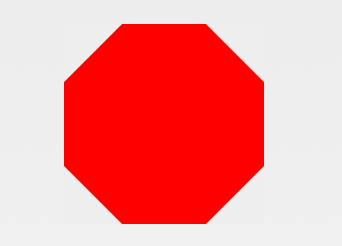
#octagon {
  width: 100px;
  height: 100px;
  background: red;
  position: relative;
}
#octagon:before {
  content: "";
  width: 100px;
  height: 0;
  position: absolute;
  top: 0;
  left: 0;
  border-bottom: 29px solid red;
  border-left: 29px solid #eee;
  border-right: 29px solid #eee;
}
#octagon:after {
  content: "";
  width: 100px;
  height: 0;
  position: absolute;
  bottom: 0;
  left: 0;
  border-top: 29px solid red;
  border-left: 29px solid #eee;
  border-right: 29px solid #eee;
}
Форма сердца Heart Shape
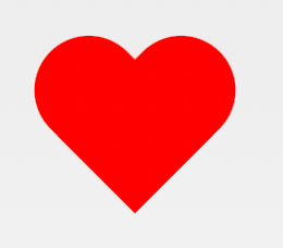
#heart {
  position: relative;
  width: 100px;
  height: 90px;
}
#heart:before,
#heart:after {
  position: absolute;
  content: "";
  left: 50px;
  top: 0;
  width: 50px;
  height: 80px;
  background: red;
  border-radius: 50px 50px 0 0;
  transform: rotate(-45deg);
  transform-origin: 0 100%;
}
#heart:after {
  left: 0;
  transform: rotate(45deg);
  transform-origin: 100% 100%;
}
Форма бесконечности Infinity Shape

#infinity {
  position: relative;
  width: 212px;
  height: 100px;
  box-sizing: content-box;
}
#infinity:before,
#infinity:after {
  content: "";
  box-sizing: content-box;
  position: absolute;
  top: 0;
  left: 0;
  width: 60px;
  height: 60px;
  border: 20px solid red;
  border-radius: 50px 50px 0 50px;
  transform: rotate(-45deg);
}
#infinity:after {
  left: auto;
  right: 0;
  border-radius: 50px 50px 50px 0;
  transform: rotate(45deg);
}
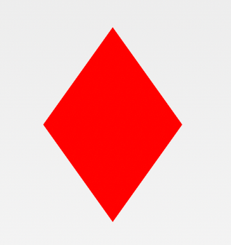
Квадратная форма алмаза (ромб) Diamond Square Shape
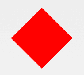
#diamond {
  width: 0;
  height: 0;
  border: 50px solid transparent;
  border-bottom-color: red;
  position: relative;
  top: -50px;
}
#diamond:after {
  content: '';
  position: absolute;
  left: -50px;
  top: 50px;
  width: 0;
  height: 0;
  border: 50px solid transparent;
  border-top-color: red;
}
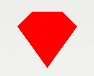
Форма алмазного щита Diamond Shield Shape
#diamond-shield {
  width: 0;
  height: 0;
  border: 50px solid transparent;
  border-bottom: 20px solid red;
  position: relative;
  top: -50px;
}
#diamond-shield:after {
  content: '';
  position: absolute;
  left: -50px;
  top: 20px;
  width: 0;
  height: 0;
  border: 50px solid transparent;
  border-top: 70px solid red;
}
Узкая форма бриллианта Diamond Narrow Shape
#diamond-narrow {
  width: 0;
  height: 0;
  border: 50px solid transparent;
  border-bottom: 70px solid red;
  position: relative;
  top: -50px;
}
#diamond-narrow:after {
  content: '';
  position: absolute;
  left: -50px;
  top: 70px;
  width: 0;
  height: 0;
  border: 50px solid transparent;
  border-top: 70px solid red;
}
Форма ограненного алмаза Cut Diamond Shape
#cut-diamond {
  border-style: solid;
  border-color: transparent transparent red transparent;
  border-width: 0 25px 25px 25px;
  height: 0;
  width: 50px;
  box-sizing: content-box;
  position: relative;
  margin: 20px 0 50px 0;
}
#cut-diamond:after {
  content: "";
  position: absolute;
  top: 25px;
  left: -25px;
  width: 0;
  height: 0;
  border-style: solid;
  border-color: red transparent transparent transparent;
  border-width: 70px 50px 0 50px;
}
Форма яйца Egg Shape
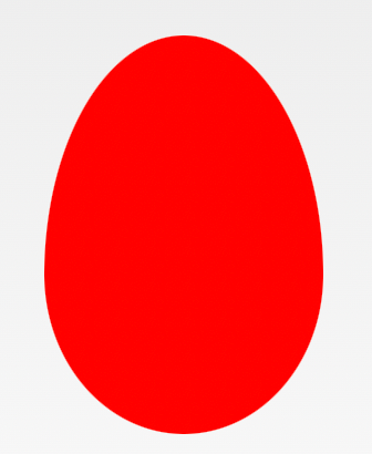
#egg {
  display: block;
  width: 126px;
  height: 180px;
  background-color: red;
  border-radius: 50% 50% 50% 50% / 60% 60% 40% 40%;
}
Фигура Pac-Man
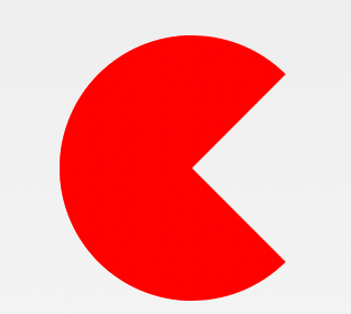
#pacman {
  width: 0px;
  height: 0px;
  border-right: 60px solid transparent;
  border-top: 60px solid red;
  border-left: 60px solid red;
  border-bottom: 60px solid red;
  border-top-left-radius: 60px;
  border-top-right-radius: 60px;
  border-bottom-left-radius: 60px;
  border-bottom-right-radius: 60px;
}
Форма разговорного пузыря Talk Bubble Shape
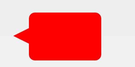
#talkbubble {
  width: 120px;
  height: 80px;
  background: red;
  position: relative;
  -moz-border-radius: 10px;
  -webkit-border-radius: 10px;
  border-radius: 10px;
}
#talkbubble:before {
  content: "";
  position: absolute;
  right: 100%;
  top: 26px;
  width: 0;
  height: 0;
  border-top: 13px solid transparent;
  border-right: 26px solid red;
  border-bottom: 13px solid transparent;
}
RSS-канал Форма RSS Feed Shape

#rss {
  width: 20em;
  height: 20em;
  border-radius: 3em;
  background-color: #ff0000;
  font-size: 14px;
}
#rss:before {
  content: '';
  z-index: 1;
  display: block;
  height: 5em;
  width: 5em;
  background: #fff;
  border-radius: 50%;
  position: relative;
  top: 11.5em;
  left: 3.5em;
}
#rss:after {
  content: '';
  display: block;
  background: #ff0000;
  width: 13em;
  height: 13em;
  top: -2em;
  left: 3.8em;
  border-radius: 2.5em;
  position: relative;
  box-shadow:
    -2em 2em 0 0 #fff inset,
    -4em 4em 0 0 #ff0000 inset,
    -6em 6em 0 0 #fff inset
}
12-гранная форма 12 Point Burst Shape
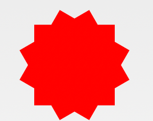
#burst-12 {
  background: red;
  width: 80px;
  height: 80px;
  position: relative;
  text-align: center;
}
#burst-12:before,
#burst-12:after {
  content: "";
  position: absolute;
  top: 0;
  left: 0;
  height: 80px;
  width: 80px;
  background: red;
}
#burst-12:before {
  transform: rotate(30deg);
}
#burst-12:after {
  transform: rotate(60deg);
}
8-ми точечная форма 8 Point Burst Shape
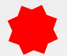
#burst-8 {
  background: red;
  width: 80px;
  height: 80px;
  position: relative;
  text-align: center;
  transform: rotate(20deg);
}
#burst-8:before {
  content: "";
  position: absolute;
  top: 0;
  left: 0;
  height: 80px;
  width: 80px;
  background: red;
  transform: rotate(135deg);
}
Форма Инь-Ян Yin Yang Shape
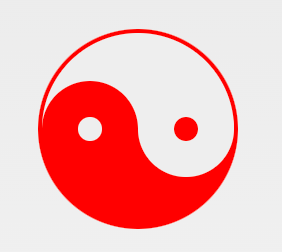
#yin-yang {
  width: 96px;
  box-sizing: content-box;
  height: 48px;
  background: #eee;
  border-color: red;
  border-style: solid;
  border-width: 2px 2px 50px 2px;
  border-radius: 100%;
  position: relative;
}
#yin-yang:before {
  content: "";
  position: absolute;
  top: 50%;
  left: 0;
  background: #eee;
  border: 18px solid red;
  border-radius: 100%;
  width: 12px;
  height: 12px;
  box-sizing: content-box;
}
#yin-yang:after {
  content: "";
  position: absolute;
  top: 50%;
  left: 50%;
  background: red;
  border: 18px solid #eee;
  border-radius: 100%;
  width: 12px;
  height: 12px;
  box-sizing: content-box;
}
Форма ленты для бейджа Badge Ribbon Shape
#badge-ribbon {
  position: relative;
  background: red;
  height: 100px;
  width: 100px;
  border-radius: 50px;
}
#badge-ribbon:before,
#badge-ribbon:after {
  content: '';
  position: absolute;
  border-bottom: 70px solid red;
  border-left: 40px solid transparent;
  border-right: 40px solid transparent;
  top: 70px;
  left: -10px;
  transform: rotate(-140deg);
}
#badge-ribbon:after {
  left: auto;
  right: -10px;
  transform: rotate(140deg);
}
Форма космического захватчика Space Invader Shape
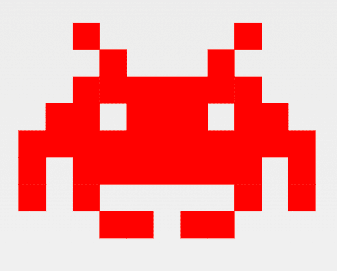
#space-invader {
  box-shadow: 0 0 0 1em red,
  0 1em 0 1em red,
  -2.5em 1.5em 0 .5em red,
  2.5em 1.5em 0 .5em red,
  -3em -3em 0 0 red,
  3em -3em 0 0 red,
  -2em -2em 0 0 red,
  2em -2em 0 0 red,
  -3em -1em 0 0 red,
  -2em -1em 0 0 red,
  2em -1em 0 0 red,
  3em -1em 0 0 red,
  -4em 0 0 0 red,
  -3em 0 0 0 red,
  3em 0 0 0 red,
  4em 0 0 0 red,
  -5em 1em 0 0 red,
  -4em 1em 0 0 red,
  4em 1em 0 0 red,
  5em 1em 0 0 red,
  -5em 2em 0 0 red,
  5em 2em 0 0 red,
  -5em 3em 0 0 red,
  -3em 3em 0 0 red,
  3em 3em 0 0 red,
  5em 3em 0 0 red,
  -2em 4em 0 0 red,
  -1em 4em 0 0 red,
  1em 4em 0 0 red,
  2em 4em 0 0 red;
  background: red;
  width: 1em;
  height: 1em;
  overflow: hidden;
  margin: 50px 0 70px 65px;
}
Форма ТВ-экрана TV Screen Shape
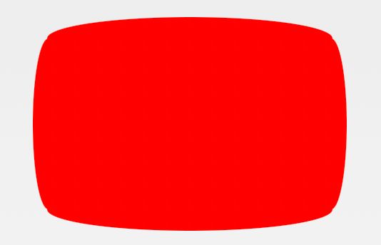
#tv {
  position: relative;
  width: 200px;
  height: 150px;
  margin: 20px 0;
  background: red;
  border-radius: 50% / 10%;
  color: white;
  text-align: center;
  text-indent: .1em;
}
#tv:before {
  content: '';
  position: absolute;
  top: 10%;
  bottom: 10%;
  right: -5%;
  left: -5%;
  background: inherit;
  border-radius: 5% / 50%;
}
Форма шеврона Chevron Shape
#chevron {
  position: relative;
  text-align: center;
  padding: 12px;
  margin-bottom: 6px;
  height: 60px;
  width: 200px;
}
#chevron:before {
  content: '';
  position: absolute;
  top: 0;
  left: 0;
  height: 100%;
  width: 51%;
  background: red;
  transform: skew(0deg, 6deg);
}
#chevron:after {
  content: '';
  position: absolute;
  top: 0;
  right: 0;
  height: 100%;
  width: 50%;
  background: red;
  transform: skew(0deg, -6deg);
}
Форма увеличительного стекла Magnifying Glass Shape
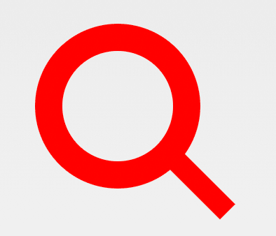
#magnifying-glass {
  font-size: 10em;
  display: inline-block;
  width: 0.4em;
  box-sizing: content-box;
  height: 0.4em;
  border: 0.1em solid red;
  position: relative;
  border-radius: 0.35em;
}
#magnifying-glass:before {
  content: "";
  display: inline-block;
  position: absolute;
  right: -0.25em;
  bottom: -0.1em;
  border-width: 0;
  background: red;
  width: 0.35em;
  height: 0.08em;
  transform: rotate(45deg);
}
Форма иконки Facebook Facebook Icon Shape
#facebook-icon {
  background: red;
  text-indent: -999em;
  width: 100px;
  height: 110px;
  box-sizing: content-box;
  border-radius: 5px;
  position: relative;
  overflow: hidden;
  border: 15px solid red;
  border-bottom: 0;
}
#facebook-icon:before {
  content: "/20";
  position: absolute;
  background: red;
  width: 40px;
  height: 90px;
  bottom: -30px;
  right: -37px;
  border: 20px solid #eee;
  border-radius: 25px;
  box-sizing: content-box;
}
#facebook-icon:after {
  content: "/20";
  position: absolute;
  width: 55px;
  top: 50px;
  height: 20px;
  background: #eee;
  right: 5px;
  box-sizing: content-box;
}
Форма луны Moon Shape
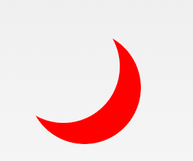
#moon {
  width: 80px;
  height: 80px;
  border-radius: 50%;
  box-shadow: 15px 15px 0 0 red;
}
Форма флага Flag Shape
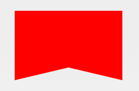
#flag {
  width: 110px;
  height: 56px;
  box-sizing: content-box;
  padding-top: 15px;
  position: relative;
  background: red;
  color: white;
  font-size: 11px;
  letter-spacing: 0.2em;
  text-align: center;
  text-transform: uppercase;
}
#flag:after {
  content: "";
  position: absolute;
  left: 0;
  bottom: 0;
  width: 0;
  height: 0;
  border-bottom: 13px solid #eee;
  border-left: 55px solid transparent;
  border-right: 55px solid transparent;
}
Конусообразная форма Cone Shape
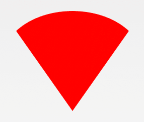
#cone {
  width: 0;
  height: 0;
  border-left: 70px solid transparent;
  border-right: 70px solid transparent;
  border-top: 100px solid red;
  border-radius: 50%;
}
Форма креста Cross Shape
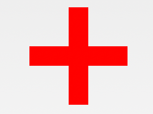
#cross {
  background: red;
  height: 100px;
  position: relative;
  width: 20px;
}
#cross:after {
  background: red;
  content: "";
  height: 20px;
  left: -40px;
  position: absolute;
  top: 40px;
  width: 100px;
}
Основа Base
#base {
  background: red;
  display: inline-block;
  height: 55px;
  margin-left: 20px;
  margin-top: 55px;
  position: relative;
  width: 100px;
}
#base:before {
  border-bottom: 35px solid red;
  border-left: 50px solid transparent;
  border-right: 50px solid transparent;
  content: "";
  height: 0;
  left: 0;
  position: absolute;
  top: -35px;
  width: 0;
}
Указатель Pointer
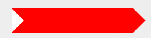
#pointer {
  width: 200px;
  height: 40px;
  position: relative;
  background: red;
}
#pointer:after {
  content: "";
  position: absolute;
  left: 0;
  bottom: 0;
  width: 0;
  height: 0;
  border-left: 20px solid white;
  border-top: 20px solid transparent;
  border-bottom: 20px solid transparent;
}
#pointer:before {
  content: "";
  position: absolute;
  right: -20px;
  bottom: 0;
  width: 0;
  height: 0;
  border-left: 20px solid red;
  border-top: 20px solid transparent;
  border-bottom: 20px solid transparent;
}
Форма замка Lock Shape

#lock {
  font-size: 8px;
  position: relative;
  width: 18em;
  height: 13em;
  border-radius: 2em;
  top: 10em;
  box-sizing: border-box;
  border: 3.5em solid red;
  border-right-width: 7.5em;
  border-left-width: 7.5em;
  margin: 0 0 6rem 0;
}
#lock:before {
  content: "";
  box-sizing: border-box;
  position: absolute;
  border: 2.5em solid red;
  width: 14em;
  height: 12em;
  left: 50%;
  margin-left: -7em;
  top: -12em;
  border-top-left-radius: 7em;
  border-top-right-radius: 7em;
}
#lock:after {
  content: "";
  box-sizing: border-box;
  position: absolute;
  border: 1em solid red;
  width: 5em;
  height: 8em;
  border-radius: 2.5em;
  left: 50%;
  top: -1em;
  margin-left: -2.5em;
}
Обратные углы Reverse Corners
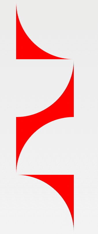
#curved-corner-bottomleft,
#curved-corner-bottomright,
#curved-corner-topleft,
#curved-corner-topright {
  width: 100px;
  height: 100px;
  overflow: hidden;
  position: relative;
}
#curved-corner-bottomleft:before,
#curved-corner-bottomright:before,
#curved-corner-topleft:before,
#curved-corner-topright:before {
  content: "";
  display: block;
  width: 200%;
  height: 200%;
  position: absolute;
  border-radius: 50%;
}
#curved-corner-bottomleft:before {
  bottom: 0;
  left: 0;
  box-shadow: -50px 50px 0 0 red;
}
#curved-corner-bottomright:before {
  bottom: 0;
  right: 0;
  box-shadow: 50px 50px 0 0 red;
}
#curved-corner-topleft:before {
  top: 0;
  left: 0;
  box-shadow: -50px -50px 0 0 red;
}
#curved-corner-topright:before {
  top: 0;
  right: 0;
  box-shadow: 50px -50px 0 0 red;
}


 на 100 слоях")


